LEP Economic Profiles - How do local assets affect productivity
Jim Twomey of Pion Economics put together a fascinating statistical analysis of Local Economic Partnership areas. I offered to visualise the findings, and here are the results (click through for the interactive visualisation):
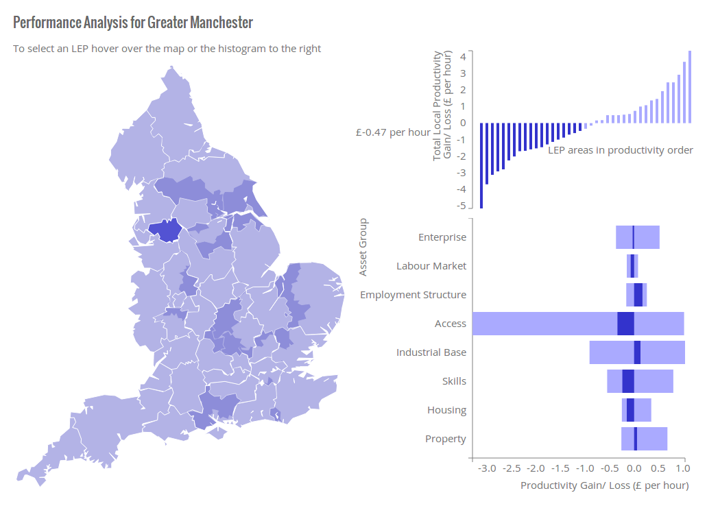
The statistical techqniue is quite advanced, and I’m still searching for a simple way to explain it. The objective is to describe differences in productivity in terms of the attributes of each place so that performance may be understood, and insights found into what a place might need to improve. First the attributes are gathered together into asset groups that correlate closely with one another (factor analysis). Then the level of these 8 groups is compared against local economic productivity to estimate the contribution of those assets to performance. More information on the technique may be found in the Developing LEP Economies Report.
The interactive visualisation is designed to provide both an overview of the patterns across LEP areas and a means of finding the results that apply to each LEP individually. The analysis presents three panels. The map on the left is for navigation. By hovering over a given place, the relevant LEP profile will be selected. On the right, the top panel presents all LEPs ordered by productivity level and the bottom panel the contribution of assets. Each chart shows the overall range of values for context, with the selected LEP area highlighted in bold. You may also navigate using the top right panel.
The interactive element allows you to explore patterns and relationships. Try, for example, drawing your cursor from the periphery of England in towards London. Note how the level of productivity and the contribution of the Access asset group changes. Try comparing rural and urban areas.
We found that this visualisation technique makes it far more efficient to present research findings (displaying 39 profiles in one graphic) and allows additional insights to be discovered through interactive exploration.